
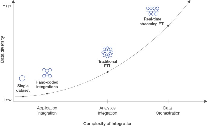
Over the past several decades, research informatics (RIS) environments within BioPharma organizations have evolved dramatically. Largely, the maturity, including our scientific understanding (that is, complex diseases) and multi-omic research contexts, has ushered increasing demand for simple and easy data integration and visualization. Several technological disruptions are coming together almost simultaneously — the mass adoption of advanced analytical technologies (that is, NGS), the rise of data science as common practice with BioPharma, the availability of computational power and resources, and the nearly limitless distribution and scaling possibility offered by cloud architectures. There are many approaches to data integration and visualization, mostly dependent on scale and purpose. While the use of basic tools persists, many purpose-built integration and visualization tools are increasingly being used, specifically addressing the demanding requirements of BioPharma research.
Excel as an Integration Tool
When it comes to combining data, the first tool scientists often look to is Microsoft Excel. Despite its shortcomings, many go out of their way to use the ampersand symbol (&) and the CONCAT function to combine data within and across worksheets. Most of this insistence is driven by their familiarity of the tool. Combining relatively small and simple data is certainly doable. However, several large, unwieldy datasets can push the limits and even crash the program. One of the major setbacks of Excel is the inability to quickly resolve issues. If you have a broken link or formula, it is often difficult to find and fix the problem. It may also be difficult to share and collaborate with the requisite roles and permissions to prevent issues. However, using Excel, with its intuitive user interface, makes it easy to create various charts and graphs reasonably quickly. Excel is commonplace for quick and dirty integrations but is not designed or intended for production integration or dashboards, as the data are often static.
Data Joins
An alternate approach is the use of common database tools like Structured Query Language (SQL). Using this SQL technique, researchers will use ‘joins’ to integrate their data tables. A data join is when two or more datasets are combined in a side-by-side manner; therefore at least one column in each dataset must be the same. This differs from a union, which puts datasets on top of each other, requiring all of the columns to be the same. Joins are relatively easy, but their complexity grows exponentially with the number of fact tables needing to be queried. Additionally, finding common dimensions across multiple data sources can be challenging. There are a few types of joins, including inner, left, right, and full. These methods are dependent on the logical relations between datasets. Once data are combined in a meaningful way, an additional layer or tool is used for visualization. Often, researchers look to various R-libraries to create common types of charts, graphs, and the like.
ETL
Instead of limiting it to the portions to answer a specific set of questions, a more robust way of integrating data is by combining entire datasets. Traditional data integration processes, also known as extract, transform, load (ETL) processes, resolved some of these issues. ETL is a type of data integration that refers to the three steps used to blend data from multiple sources. These three database functions are combined into one tool to pull data out of one database and place it into another.
- Extract is the process of reading data from a database. In this stage, the data is collected, often from multiple and different types of sources
- Transform is the process of converting the extracted data from its previous form into the form it needs to be in so that it can be placed into another database. Transformation occurs by using rules or lookup tables or by combining the data with other data
- Load is the process of writing the data into the target database
Using ETL, data are extracted from multiple transactional databases, transformed into a normalized format for analysis, and loaded into a data warehouse where scientists can slice and dice it. The problem with this approach is that, typically, the IT department, rather than data scientists, is in charge of the ETL process. This setup ensures that ETL is standardized, regularly scheduled, and centrally governed but is limiting if a scientist needs to combine data sources ad hoc.
Visual Analytics Tools
Knowledge of SQL and advanced Excel skills will remain crucial in most branches of data science for the foreseeable future. Notwithstanding, combining dozens of fact tables in complex queries can be tedious work even for seasoned scientists. There are several dedicated, commercially available tools that do the same work in minutes or even seconds.
Visual analytics tools are basically graphical user interfaces for performing analytical operations on data with little to no assistance from IT. Since data analysis always starts with preparation, visual analytics tools also offer a range of data preparation features, including data blending functionality.
Real-Time Dashboards and the Future
Building on these integration and analytics tools are operational dashboards, which use almost real-time data to monitor and spot the moment any issues or discrepancies in business processes and/or transactions may arise. They are typically viewed multiple times a day and used to observe progress towards a target for a given increment (hour, day, month). Oftentimes, they are used in manufacturing or other production environments, where any sort of delay or issue halting progress can be catastrophic.
In 2002, Steven Spielberg and Tom Cruise unveiled the thriller Minority Report. In the movie, Tom Cruise’s character uses an interactive screen to investigate murders that have yet to happen. All information related to the murders — location, target, suspect — was provided to him in the form of dynamic video feeds. The entire system was controlled using a touchscreen and operated through a glove. Although a commercial Minority Report-like interface has yet to be commercially released, this is likely what the future could look like.